If you click on a link and make a purchase we may receive a small commission. Read our editorial policy.
Sleeping dragons, illustration, and The Nutcracker with Natalie Andrewson
Illustrator Natalie Andrewson dives into her creative process
Natalie Andrewson builds dreamlike worlds in single images. A sleeping dragon on a grassy knoll, a Moth Queen descending from a palatial tree. Her expressive and bright riso prints have been a big hit at every artist alley at which I've spotted her table. But her work doesn't stop there-- Andrewson also makes comics. Her debut graphic novel The Nutcracker and the Mouse King is a sparkling adaptation of ETA Hoffman, bringing the sinister and scary alongside the fairytale and breathing a new illustration-forward life into the classic story.
In this interview, Andrewson tells us about her new poster design for Thought Bubble, how her artistic process differs depending on publication format, and how she developed her storytelling voice for The Nutcracker and the Mouse King.
Popverse: You designed the poster for this year’s Thought Bubble! How did that come about?
Natalie Andrewson: They contacted me, which was a great surprise! I’d always wanted to attend Thought Bubble but never found enough time to get out to the UK for it. I’m thrilled to finally have an excuse to visit! It was such a pleasant experience making the poster for them as well. They sent me a brief of which pieces in my portfolio they liked and said ‘have fun with it!’, which I absolutely did!
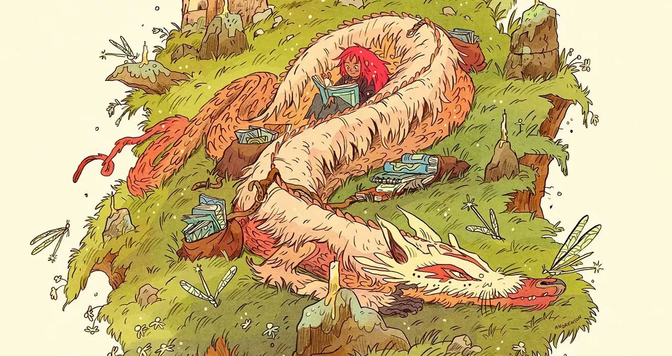
Can you talk about the concept behind your beautiful dragon design?
Well, I knew I wanted to draw a scene roughly inspired by Northern England where the convention is located, and the dragon design came as a spontaneous addition after figuring out the setting. Getting such an open prompt can sometimes be daunting (in an exciting way), so I usually start with the basic themes of what I know about a project. For this one it was comics, thought bubbles, and Northern England, so I decided to start with a google search of the area around Leeds, which turned out to be a great jumping off point. The landscape really looks like a classic English fairytale setting, with rolling hills, little cottages and endless sky.
I was very inspired to add a little magic to this already dreamy landscape, but wasn’t sure where I would add it. I started doodling a girl who had escaped her daily life to read a story alone on the dales. I knew I also wanted to add a bit of something inspired by Hadrian’s wall, since I love seeing ancient history in stories, so I started adding bits of rocks and walls as if they were portals…but it wasn’t scratching that fantasy itch quite like I needed. It was when I added a bit of taller grass around the girl that I realized it looked like she was nestled in the crook of a dragon’s warm, fuzzy body- so I ran with it!
The grass became the Falkor-like hair of the dragon and I changed the girl’s pose to be more of a relaxing cuddle with the dragon and her book. That’s when the story really came to life for me, and I began adding the book bindles to show she had come here, through the portals, to enjoy some peace and quiet with her dragon. Just like some of us will travel to Leeds for Thought Bubble to enjoy each other’s comics and company, and escape the world for just a bit.
You run a very successful Patreon where you send your patrons a blind box riso print every month. Why a blind box?
So, Patreon was a very stressful concept to me at first- I was looking for a way to make my Riso work financially viable without making it feel like an unnecessary burden. I needed to find a way to continue buying paper, pay for more time at the SVA RisoLAB and find a way to get my printed work out the door faster than I could sell at conventions- I also really wanted to continue experimenting with the Riso and not feel the pressure to keep up with trends in my art.
I made my Patreon a blind-box, so I could be motivated to make something beautiful for my patrons, but also [not] feel the pressure of worrying whether people would like it or not. I also made the Patreon cheaper than when I sell them at market, so patrons know they’re getting a deal as well. Now, after realizing all I really want to make is fantasy work, I send out a fantasy themed print at the end of each month, along with a ‘Riso Breakdown’ describing my reasons behind choosing color, themes and details in that month’s work. I also talk about all the problems I had along the way (there are always problems when working with Riso, but they’re great puzzles to solve)!
I finally feel the freedom to make regular personal work on my own terms, something I don’t think I’ve been able to do since I was a kid. Patreon, and the blind box style, has helped me build my own personal voice, feel confident in my work again, and experiment freely with subjects that are close to my heart.
Over the years, you’ve made a bunch of minicomics, collaborated with writers on comics, and now you've written and drawn a full-length children’s graphic novel from First Second, an adaptation of ETA Hoffman’s Nutcracker and the Mouse King. Why did you choose to adapt the Nutcracker?
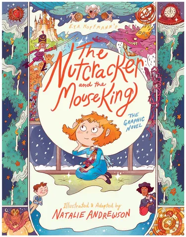
Well, first off, I chose to do an adaptation of The Nutcracker because I really love it! I love the music and the darkness of the mouse king battle and the fairytale quality of the dances in the Nutcracker’s realm. But I didn’t actually request to make this book, Calista Brill at First Second Books asked me if I would adapt it. Seems like they had it on the docket, but wanted a twist on the ballet.
The original story by E.T.A. Hoffmann is very different from Tchaikovsky and Dumas’ ballet, they really cut it up and added several new sections and left out a lot of the heart of the original story. Calista pitched this Nutcracker version to me as a beautiful but wild fever dream, similar to Alice in Wonderland -so I had to accept. After working with her on a few other, smaller projects, she could tell the themes of The Nutcracker were right up my alley for the work I was creating, and of course it was a great fit.
One thing that really stood out to me about your Nutcracker was use of this fairytale-esque language. How did you develop this storytelling voice?
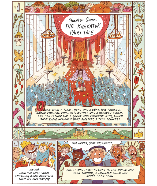
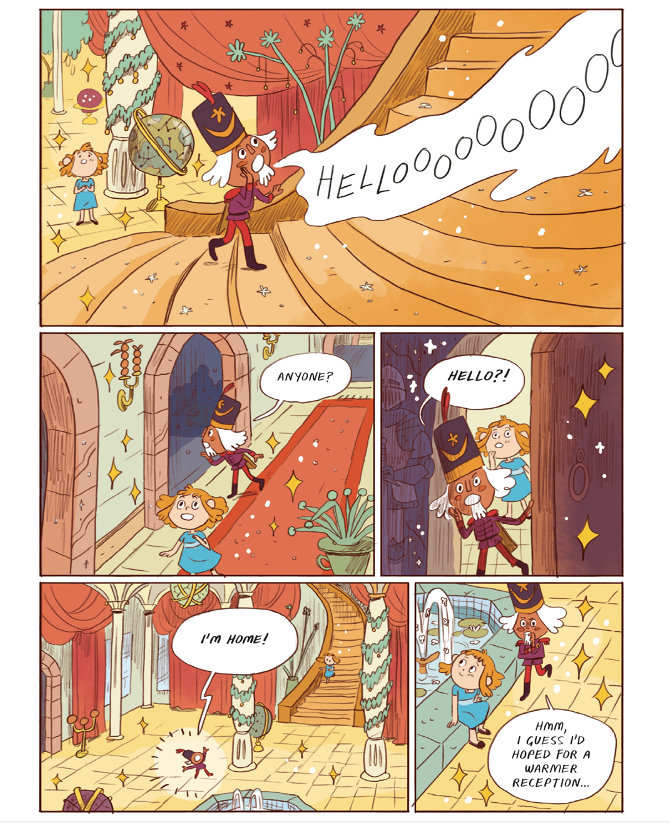
Some of that was directly translated from the original German Nutcracker story and some of it I really emphasized to make it fit with the mood of the story. As I was translating the original German text to English there were lots of speaking parts for the characters that needed to be modernized and more interesting for current readers…so I tried to add in the flowery fairytale language when my writing was feeling a little too talky. I also learned this voice from reading some of the old 1850’s English translations of The Nutcracker and Princess Pirlipat, as well as some other contemporary Romantic literature and poetry like Victor Hugo, Jane Austen, William Blake and Emily Brontë.
In the process, I gained a great love for the Romantic movement in how emotional, introspective, egalitarian, and spontaneous the media was at the time, so the writing definitely stuck with me while writing Nutcracker, and beyond- this project was truly a gift in exploring this movement and realizing I very much connect with the Romantics.
The central theme of The Nutcracker and the Mouse King is the attempted suppression of imagination. When Marie is told not to talk about the Nutcracker any more, you have her drawing. Why was that an important detail for you to include?
It was very important to me to show that Marie was continuing to express her imagination no matter the efforts of her parents to discourage it. She draws to be able to communicate the part of herself that she feels is true and wonderful without stopping all together, to show the world she believes in is real and too powerful to be tucked away. She’s no longer ‘disturbing’ anyone with her imagination, but she doesn’t let it go.
I also wanted her to have a quiet moment of faith in The Nutcracker before a triumphant reveal of the truth of her stories. I feel like this is a classic theme in stories of imagination- she really believes, and so it is real.
Of course, drawing is a huge part of my journey in finding a safe place to express my imagination and curiosity. When I was young I was told not to draw on homework or tests, threatening failure if I continued. And then later when my parents realized drawing was something I loved they enrolled me in a Magnet Arts High School…where I was told to never to draw cartoons because they weren’t art. I feel like a lot of creative people get this kind of discouraging instruction where they’re lead away from the things they naturally do and feel proud of because it’s seen as annoying or distracting from greatness. That’s all so, so wrong and ridiculous.
I am so happy now because of my drawing and creative skills, but now I have to unlearn the bad self talk and anxiety I gained as a young person being told what not to do, instead of being guided.
Because of my experience (and probably Hoffmann’s as well, as this moment is pretty closely resembled in the book) I wanted to clearly show Marie happy and joyful after sticking by her imagination, which is personified by the Nutcracker, no matter the consequences. It’s a classic fight between reason and emotion, the Enlightenment vs the Romantic period…Hoffmann was a true Romantic.
You work in riso a lot for your personal stuff, but you also make art for printed books and you also design for animation. Can you talk about the differences working for riso printing and digital printing or even for just plain digital presentation? How do you approach each type of project?
The beginning process is almost identical- I start with concepts, sketches, and then make the line art all the same no matter the final. It’s in the coloring where it really splits. Even when I’m doing color mock-ups in RGB (the computer/photoshop) I have to think of what colors I can make with the specific Riso colors I have access to, rather than just choosing whatever colors I want on the Color Picker. Like, I can’t make the color Aqua in my final Riso colors so I generally avoid it when making color sketches in photoshop intended to be printed with the Riso.
On the other hand, when I’m making digital work I really have to limit my palette or else my work just ends up as a rainbow (which, it gets there anyway but it’s a slightly more harmonized rainbow, for sure). I add a lot more texture and details to my digital work as well, since I can’t rely on some of that delicious Riso tactile texture. There are a lot more gradients and extra color adjustment layers that sometimes get just as complicated as my layered Riso work.
I’m also making some of the same considerations for CMYK book or printed commercial work, so I have to consider what greens and yellows and light blues I’ll be using. CMYK is literally mixing dots of Cyan, Magenta, Yellow and Black together to make the whole spectrum of colors, and if the color I choose in RGB can’t be mixed with that palette, then my final printed book will look dull. It’s always a part of the final project I have to consider!
But when I’m more in control of the color mixing with Riso (I have access to 7 spot colors I can mix to create other colors, but sadly no Aqua) I have a lot more fun with figuring out what I can do with ink.
And since Popverse is a site for fans, we like to ask artists what they’re fans of. What’s been on your mind lately? Could be artists, a tv show, sports, a new restaurant open in town— what are you a fan of?
Ok, I can’t help it, I have to talk about Our Collective Daddy, Pedro Pascal, and The Last of Us.
I never played the video game because I can’t sit through zombie media with my eyes open, but I’ve been following screen writer Craig Mazin on Script Notes for several years now and I am obsessed with anything he does. I listen to him on a podcast called Script Notes, which is a great resource for screen writers, but also just a great resource for…life…and living a creative life while dealing with creative puzzles.
Craig does the show with John August, and I have learned SO much from them about my process and what it takes to be a story writer. Craig and John honestly feel like older brothers or DADS who just want to help get me to where I need to be (I’m Ellie and Baby Yoda…no wait that’s Pedro). I have been an especially big fan of Craig’s work since Chernobyl, and I find his writing on The Last of Us really exceptional and brilliantly economical. I’ve heard his screen writing makes the story fresh for audiences familiar with the game and it also doesn’t leave me questioning what’s happening or wishing I’d played the game.
As a comic artist, I’m always looking for the fastest way to tell a story in the most dynamic single image and sometimes I find myself thinking ‘what would Craig say about this? Leave it? Does it really matter?’ He often talks about cutting the details that aren’t working, keeping moments with heart and just having fun. It’s been great to listen to someone I would call a mentor and then watch his work with his voice in my head…and get to see Pedro Pascal on screen at the same time of course!!! *eyeballs emojiiiiii*
You can find Natalie's work on her website, Instagram, and Twitter.
Purchase a copy of The Nutcracker and The Mouse King on Amazon, Barnes & Noble, or Bookshop.org.
Natalie Andrewson was spotlighted in Popverse's visit to C2E2's artist alley last year!
Follow Popverse for upcoming event coverage and news
Find out how we conduct our review by reading our review policy
Let Popverse be your tour guide through the wilderness of pop culture
Sign in and let us help you find your new favorite thing.






Comments
Want to join the discussion? Please activate your account first.
Visit Reedpop ID if you need to resend the confirmation email.